Rooted
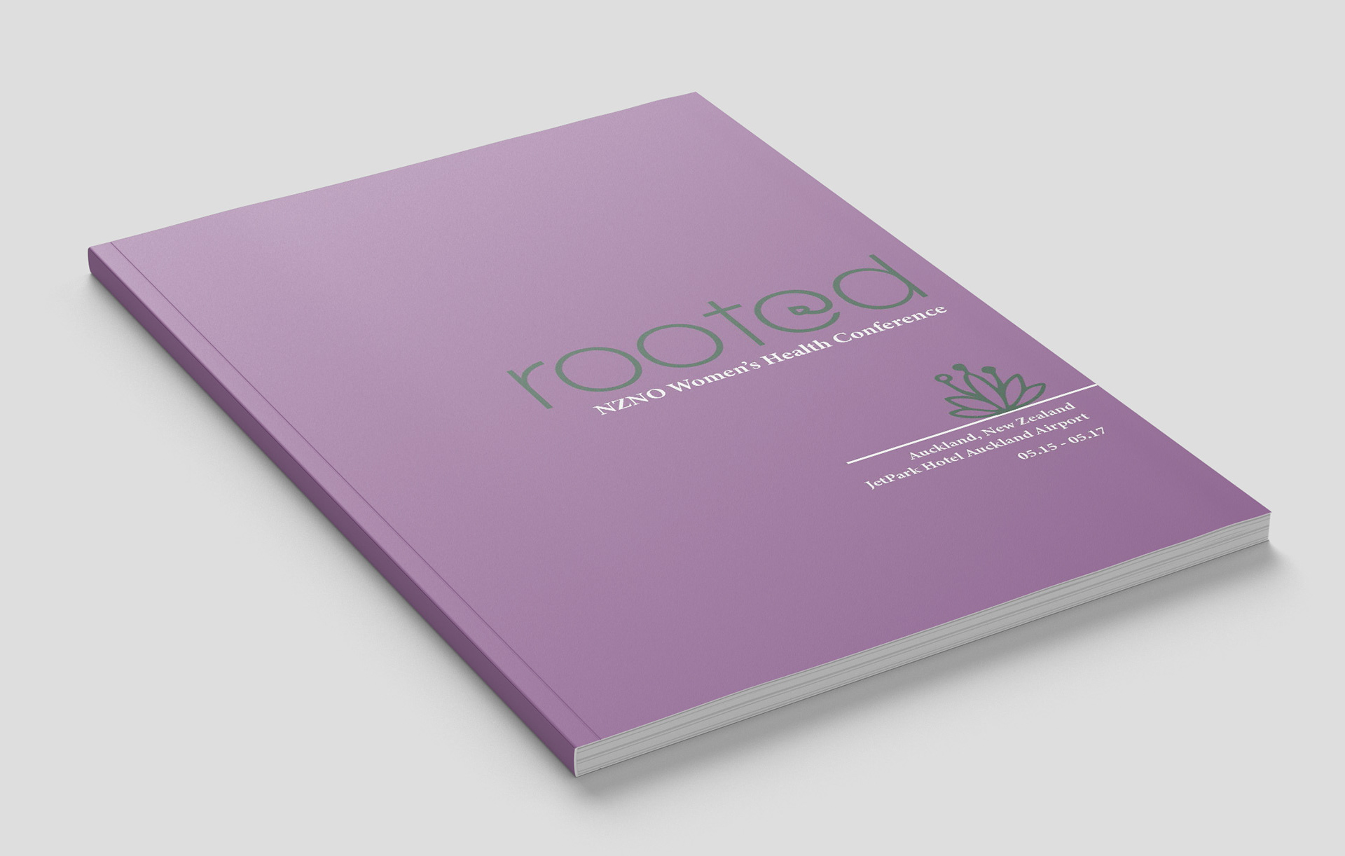
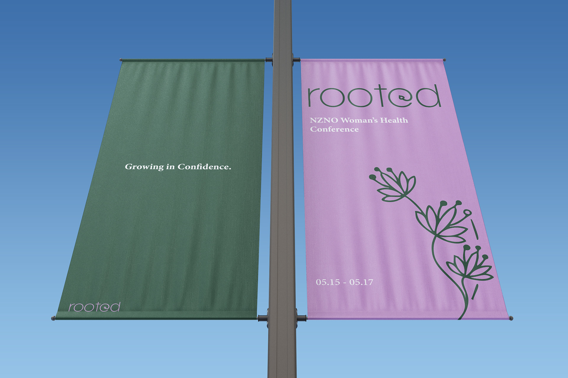
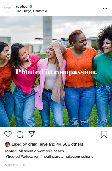
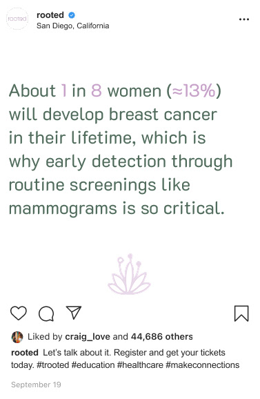
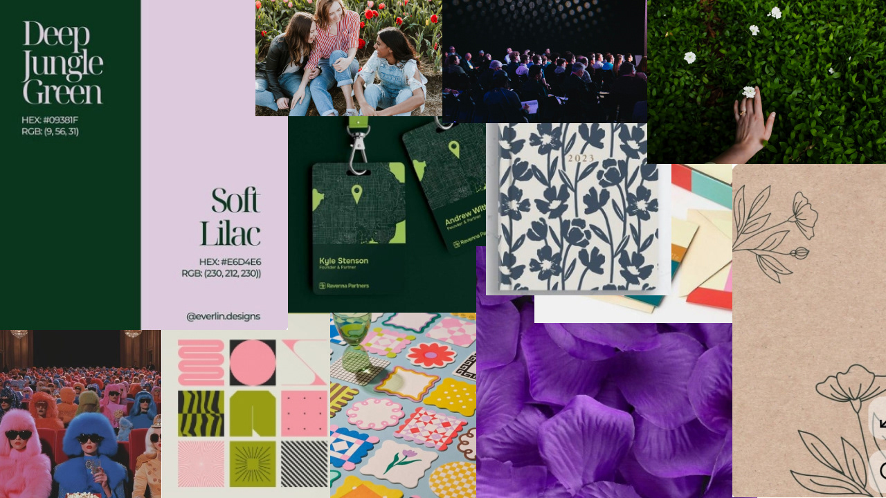
Objective- To create a meaningful and enduring identity for a women's health conference that celebrates growth, wellness, and empowerment. Through thoughtful symbolism representing life, prosperity, and renewal, the brand aiming to foster a sense of connection and encouragement. A palette of soft, natural tones paired with refined design elements creating an atmosphere that feels welcoming, inspiring, and supportive while also honoring the resilience and strength of women.
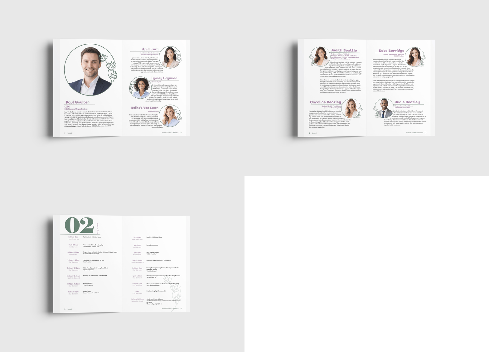
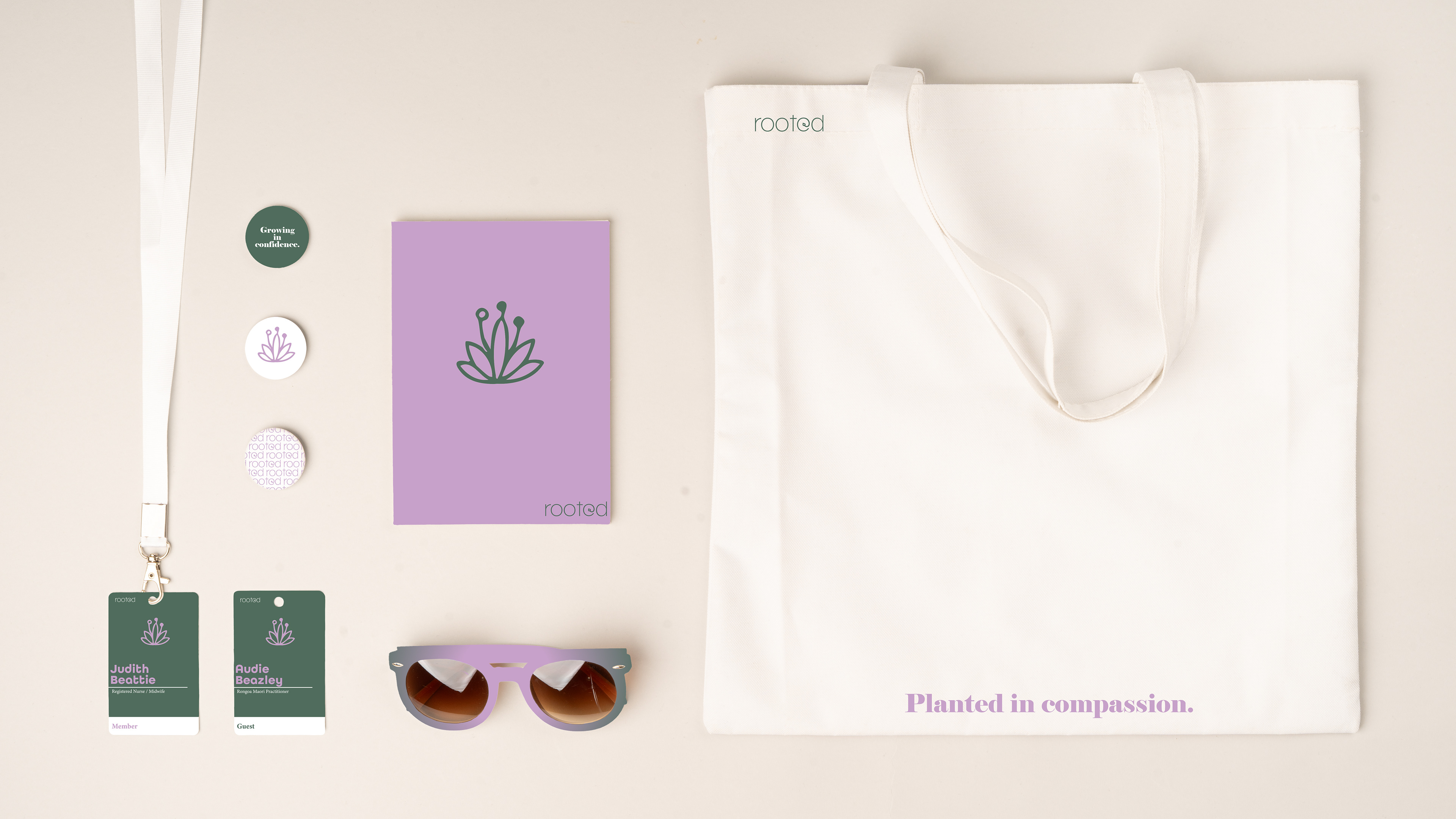
Approach- Focused on creating a visual identity that reflects health, growth, and prosperity. A symbolic logo was developed to represent themes of well-being, development, and renewal, while incorporating soft green and light purple tones to create a sense of balance, care, and optimism. Floral-inspired elements were woven throughout the design to reinforce ideas of flourishing and transformation. Together, these elements create an experience that feels welcoming, empowering, and supportive for women.
Course- DSGN 206
Instructor- Sean B.
Term- Spring 2025